Atelier Edition
Ashcombe Vance House — Private International Property Representation
Properties of consequence.
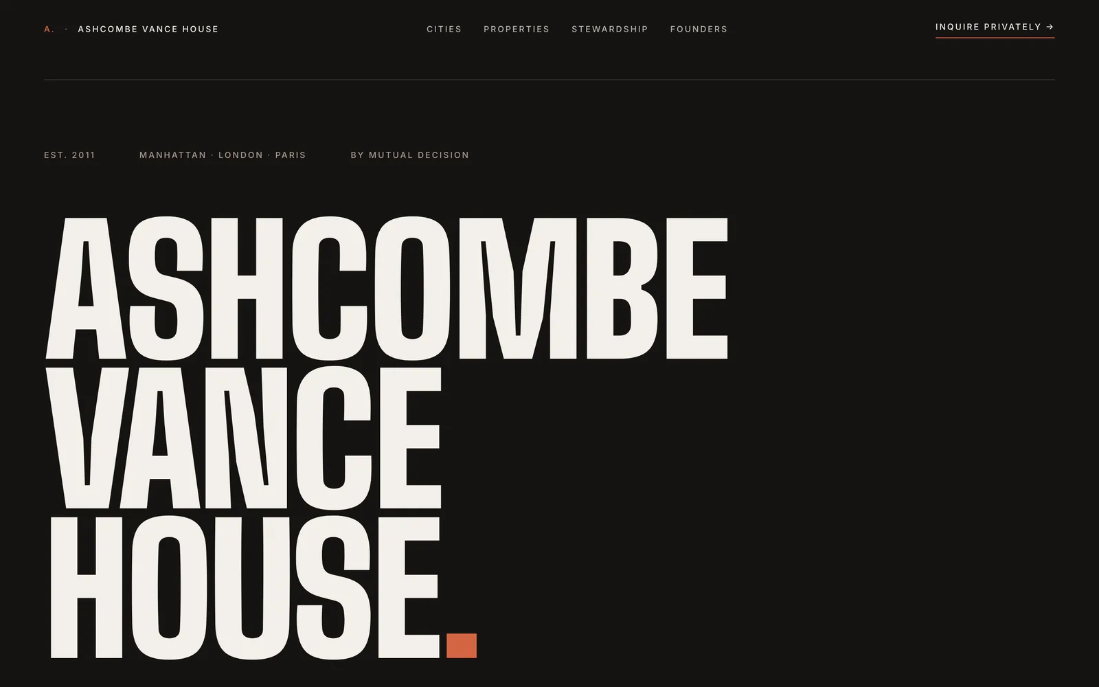
A private property house operating across Manhattan, London, and Paris. Edition RED — warm concrete, Big Shoulders Display 900, terracotta accent — reframes international property as institutional architecture rather than brokerage marketing.
Ashcombe Vance House is a fictional case study designed by ALO Design Pros to argue that real estate websites have been visually impoverished for two decades — and that a property of consequence deserves the same editorial treatment as a fragrance maison or a literary press. A single page, ten sections, two monument moments, zero photography. The design holds without imagery: the wordmark stacked across three lines in Big Shoulders Display 900 is the entire argument. The three cities (MANHATTAN. LONDON. PARIS.) function as a typographic system carried through the meta strip, the monument section, the property reference codes (AVH·MAN, AVH·LON, AVH·PAR), and the footer practice rooms. The dossier section treats one property — a Grade I listed townhouse on Eaton Square — as an auction lot with provenance and stewardship language, not listing copy. The index of properties shows six rows, implies twenty-seven exist, and tells the reader twenty-one further are represented privately. Discretion is the conversion mechanism. The entire page has one bordered button: Begin private inquiry.
Ashcombe Vance House before the rebuild.
International property representation has been visually impoverished for two decades — split between Zillow-loud listings and Helvetica-and-travertine luxury brokerages copying each other. A house that earns its instructions one decision at a time had no register that read like an auction catalogue rather than a marketing site.
A property house that reads like a catalogue, not a brokerage. Discretion as the design argument.
Single-page institutional site with two monument moments and zero photography
What’s Built
- Two monument moments only: hero "ASHCOMBE / VANCE / HOUSE." and "MANHATTAN. / LONDON. / PARIS."
- Zero photography — the typographic system carries the brand
- Three-city architecture with reference-code prefixes (AVH·MAN, AVH·LON, AVH·PAR)
- Featured property dossier with Cubitt provenance and "Guide on application" pricing register
- Index of properties as auction catalogue — six rows shown, twenty-one represented privately
- Stewardship process as four-phase numerical anchor (01–04, no icons)
- Single bordered Inquiry CTA — the only button on the page
Results

Want this for your brand?